Introduction:
CSS Transforms allow you to change the shape, size, and position of elements on a web page in exciting ways. Whether you want to rotate, scale, or skew an image, CSS transforms can help you make your designs dynamic and engaging. In this beginner’s guide, we’ll explore how to use CSS transform properties like translate(), rotate(), scale(), skew(), and matrix() to create visually stunning effects.
By the end of this post, you’ll know how to manipulate elements with CSS transforms and bring your web pages to life with creative visual changes. Ready to get started? Let’s dive in!
- 1. What Are CSS Transforms?
- 2. The translate() Function: Moving Elements
- 3. The rotate() Function: Spinning Elements
- 4. The scaleX() and scaleY() Functions: Stretching Elements
- 5. The scale() Function: Resizing Elements Proportionally
- 6. The skewX() and skewY() Functions: Tilting Elements
- 7. The skew() Function: Skewing Elements Both Ways
- 8. The matrix() Function: Combining Transformations
- 9. Practical Examples and Code Snippets
- 10. Common Mistakes to Avoid
- Conclusion
1. What Are CSS Transforms?
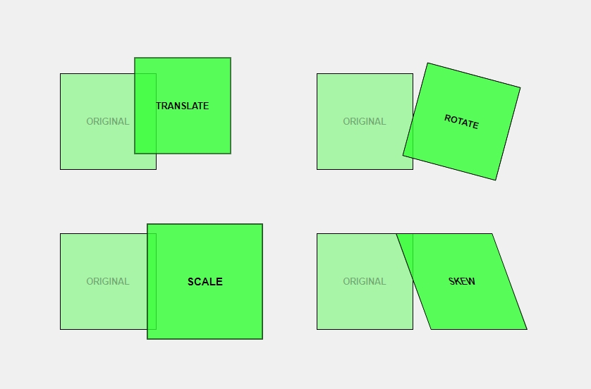
CSS Transforms are a set of properties that allow you to change the shape, size, and position of elements on a web page. These transformations are done in two-dimensional or three-dimensional space, depending on your needs. Unlike traditional CSS properties like margin or padding, transforms give you creative control over your elements.
For example, you can:
- Move an element from one spot to another
- Rotate an element like a wheel
- Resize an element to make it bigger or smaller
- Skew an element to give it a slanted look
These transformations can be combined to create dynamic and interactive web experiences.
2. The translate() Function: Moving Elements
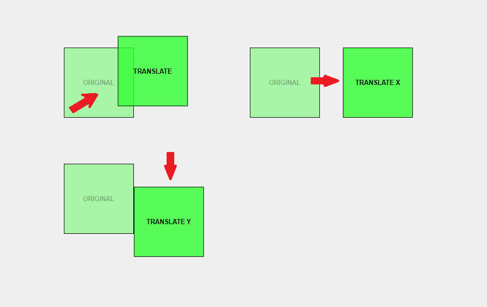
The translate() function is like giving your element a new home on the screen. It allows you to move an element from its original position to a new one. This movement can happen along the X-axis (horizontally), the Y-axis (vertically), or both.
Syntax:
.element {
  transform: translate(x, y);
}x: How far to move the element horizontally (right if positive, left if negative).y: How far to move the element vertically (down if positive, up if negative).
Example:
.box {
  transform: translate(50px, 100px);
}In this example, the element with the class .box will move 50 pixels to the right and 100 pixels down from its original position.
3. The rotate() Function: Spinning Elements
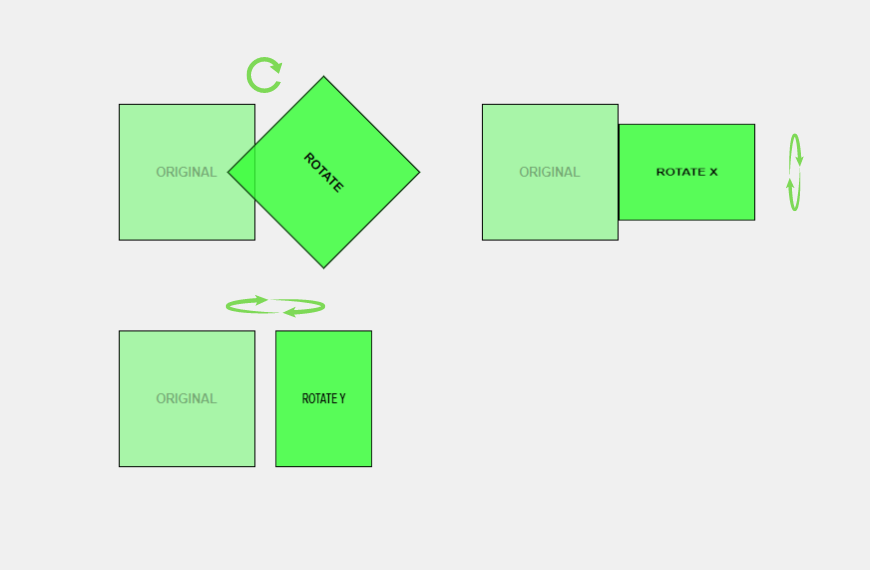
The rotate() function allows you to spin an element around a fixed point (its center by default). This is especially useful for creating effects like rotating images or spinning icons.
Syntax:
.element {
  transform: rotate(angle);
}angle: The degree of rotation. Positive values rotate clockwise, and negative values rotate counterclockwise.
Example:
.wheel {
  transform: rotate(45deg);
}This example rotates the element by 45 degrees clockwise.
4. The scaleX() and scaleY() Functions: Stretching Elements
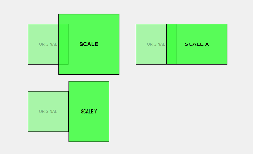
Sometimes, you may want to stretch an element to make it wider or taller. This is where the scaleX() and scaleY() functions come into play.
scaleX(): Stretches the element horizontally.scaleY(): Stretches the element vertically.
Syntax:
.element {
  transform: scaleX(scaleFactor);
}
.element {
  transform: scaleY(scaleFactor);
}scaleFactor: A number that represents the scaling factor. Values greater than 1 enlarge the element, while values between 0 and 1 shrink it.
Example:
.rectangle {
  transform: scaleX(2); /* Doubles the width */
}
.tallBox {
  transform: scaleY(0.5); /* Halves the height */
}
5. The scale() Function: Resizing Elements Proportionally
The scale() function is similar to scaleX() and scaleY(), but it scales the element proportionally in both directions.
Syntax:
.element {
  transform: scale(scaleFactor);
}scaleFactor: A number that represents how much the element should be scaled.
Example:
.square {
  transform: scale(1.5); /* Increases the size by 50% */
}This code increases the size of the .square element by 50% in both width and height.
6. The skewX() and skewY() Functions: Tilting Elements
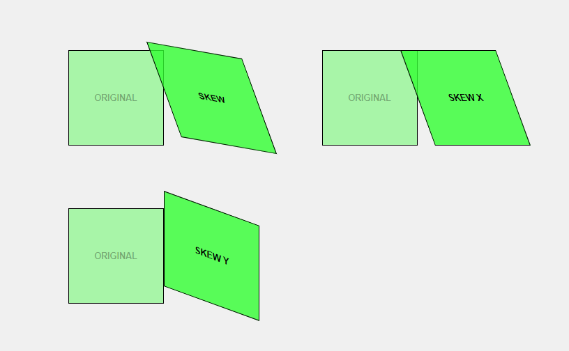
The skewX() and skewY() functions allow you to tilt elements along the X-axis or Y-axis. This can give elements a slanted or distorted look.
skewX(): Tilts the element along the X-axis.skewY(): Tilts the element along the Y-axis.
Syntax:
.element {
  transform: skewX(angle);
}
.element {
  transform: skewY(angle);
}angle: The degree to which the element should be skewed.
Example:
.leanBoxX {
  transform: skewX(30deg); /* Tilts the element 30 degrees along the X-axis */
}
.leanBoxY {
  transform: skewY(15deg); /* Tilts the element 15 degrees along the Y-axis */
}
7. The skew() Function: Skewing Elements Both Ways
The skew() function allows you to tilt an element along both the X-axis and Y-axis simultaneously.
Syntax:
.element {
  transform: skew(xAngle, yAngle);
}xAngle: The degree of skewing along the X-axis.yAngle: The degree of skewing along the Y-axis.
Example:
.diamondShape {
  transform: skew(20deg, 10deg);
}This code tilts the element by 20 degrees along the X-axis and 10 degrees along the Y-axis, creating a diamond-like shape.
8. The matrix() Function: Combining Transformations
The matrix() function is a more advanced and complex way to perform multiple transformations at once. It combines translate, rotate, scale, and skew into a single function. matrix(scaleX(), skewY(), skewX(), scaleY(), translateX(), translateY())
Syntax:
.element {
  transform: matrix(a, b, c, d, e, f);
}a,b,c,d: These values control the scaling and rotation.e,f: These values control the translation (movement).
Example:
.complexTransform {
   /* matrix(scaleX(), skewY(), skewX(), scaleY(), translateX(), translateY()) */
  transform: matrix(1, -0.3, 0.1, 1, 40, 10);
}This example combines scaling, rotation, and translation in one line of code.
9. Practical Examples and Code Snippets
Now that you understand each transform function, let’s explore some practical examples of how you can combine these transformations to create dynamic web elements.
Example 1: Rotating and Scaling a Button
.button {
  transform: rotate(10deg) scale(1.2);
  transition: transform 0.3s ease;
}

.button:hover {
  transform: rotate(0deg) scale(1);
}This code rotates and scales a button when you hover over it, making it look more interactive.
Example 2: Creating a Sliding Menu
.menu {
  transform: translateX(-100%);
  transition: transform 0.5s ease;
}

.menu.open {
  transform: translateX(0);
}This example creates a sliding menu that appears when a class is added.
10. Common Mistakes to Avoid
- Overusing Transforms: Too many transforms can slow down your web page.
- Not Using Browser Prefixes: Some older browsers require prefixes like
-webkit-or-moz-for transforms. - Forgetting About Accessibility: Make sure your transformed elements are still accessible to all users.
Advanced Tips and Tricks
- Combine with Transitions and Animations: Use CSS Transitions or Animations for smooth effects.
- Use
transform-origin: Control the point around which an element transforms. - 3D Transforms: Experiment with 3D effects using
rotateX(),rotateY(), andperspective().
Conclusion
CSS Transforms give you the power to create dynamic, interactive web experiences by manipulating elements in exciting ways. From moving elements around to spinning, scaling, and skewing them, the possibilities are endless. Start practicing with these transforms today, and soon you’ll be able to make your web pages come alive!
Try using CSS Transforms on your own web page and see how they can make your content more engaging. Experiment with different functions and share your results!

