Introduction:
Animations on websites are like magic tricks—they make things appear, disappear, spin, bounce, and move in fun ways. But how do web designers create these animations? The answer is CSS animations!
CSS animations allow you to create engaging, eye-catching animations without using complex code or software. In this guide, we’ll explore the basics of CSS animations, including key properties such as @keyframes, animation-name, animation-duration, animation-delay, animation-iteration-count, animation-direction, animation-timing-function, animation-fill-mode, and animation. By the end of this post, you’ll know how to create animations that make your website stand out!
Have you ever seen a website with cool effects and wondered how it was made? You can create these effects too, even if you’re new to coding. Let’s dive in!
- 1. What Are CSS Animations?
- 2. Understanding @keyframes
- 3. Defining animation-name
- 4. Setting animation-duration
- 5. Using animation-delay
- 6. Controlling Repetition with animation-iteration-count
- 7. Changing Animation Direction with animation-direction
- 8. Timing Your Animation with animation-timing-function
- 9. Filling the Gaps with animation-fill-mode
- 10. The All-in-One animation Property
- 11. Practical Examples of CSS Animations
- Common Mistakes to Avoid
- Conclusion
1. What Are CSS Animations?
CSS animations are special effects that make elements on your webpage move or change over time. Instead of having static (unchanging) content, you can create animations that bring your website to life. For example, you can make a button bounce when someone clicks it, or make text fade in and out.
CSS animations work by gradually changing an element’s style from one state to another. This is done using keyframes, which define the start and end points (and sometimes intermediate steps) of the animation.

2. Understanding @keyframes
@keyframes is the building block of CSS animations. It defines what the animation will look like at certain points during its execution. Keyframes are like a storyboard that tells the browser how an element should change over time.
Syntax of @keyframes:
@keyframes animation-name {
  from {
    /* Starting style */
  }
  to {
    /* Ending style */
  }
}Or, you can use percentages to define multiple steps:
@keyframes animation-name {
  0% {
    /* Initial state */
  }
  50% {
    /* Midway state */
  }
  100% {
    /* Final state */
  }
}Example:
Let’s create a simple animation that makes an element fade in:
@keyframes fadeIn {
  from {
    opacity: 0; /* Start transparent */
  }
  to {
    opacity: 1; /* End fully visible */
  }
}This @keyframes block defines an animation named “fadeIn” that changes the opacity of an element from 0 to 1.
3. Defining animation-name
The animation-name property specifies the name of the @keyframes that will be applied to the element. This is how you link the keyframe animation to a specific element on your page.
Syntax:
.element {
  animation-name: fadeIn;
}Example: If you have a paragraph element that you want to fade in, you can use:
p {
  animation-name: fadeIn;
}4. Setting animation-duration
The animation-duration property determines how long the animation should take to complete one cycle. You can set it in seconds (s) or milliseconds (ms).
Syntax:
.element {
  animation-duration: 2s; /* Animation lasts 2 seconds */
}Example: To make the paragraph fade in over 2 seconds:
p {
  animation-name: fadeIn;
  animation-duration: 2s;
}5. Using animation-delay
The animation-delay property specifies a delay before the animation starts. This can be useful if you want the animation to start a bit later, like after a button is clicked or when the page loads.
Syntax:
.element {
  animation-delay: 1s; /* Wait 1 second before starting */
}Example: To delay the start of the fade-in animation by 1 second:
p {
  animation-name: fadeIn;
  animation-duration: 2s;
  animation-delay: 1s;
}6. Controlling Repetition with animation-iteration-count
The animation-iteration-count property defines how many times the animation will play. You can set it to a specific number or use the keyword infinite for endless repetition.
Syntax:
.element {
  animation-iteration-count: 3; /* Animation plays 3 times */
}Example: To make the paragraph fade in and out 3 times:
p {
  animation-name: fadeIn;
  animation-duration: 2s;
  animation-iteration-count: 3;
}7. Changing Animation Direction with animation-direction
The animation-direction property controls the direction in which the animation runs. It can be set to:
normal(default): Runs from start to finish.reverse: Runs from finish to start.alternate: Runs forwards on odd iterations, backwards on even iterations.alternate-reverse: Runs backwards on odd iterations, forwards on even iterations.
Syntax:
.element {
  animation-direction: alternate; /* Alternates direction every time */
}Example: To alternate the direction of the fade-in animation:
p {
  animation-name: fadeIn;
  animation-duration: 2s;
  animation-iteration-count: 3;
  animation-direction: alternate;
}
CSS Animation – Animation Direction Modes
8. Timing Your Animation with animation-timing-function
The animation-timing-function property defines the speed curve of the animation, making it more natural or dramatic. Common values include:
- ease: Starts slow, speeds up, then slows down (default).
- linear: Maintains the same speed throughout.
- ease-in: Starts slow and then speeds up.
- ease-out: Starts fast and then slows down.
- ease-in-out: Starts slow, speeds up, then slows down.
Syntax:
.element {
  animation-timing-function: ease-in-out;
}Example: To make the paragraph fade in with a smooth start and end:
p {
  animation-name: fadeIn;
  animation-duration: 2s;
  animation-timing-function: ease-in-out;
}Animation-timing-function
9. Filling the Gaps with animation-fill-mode
The animation-fill-mode property specifies how a CSS animation should apply styles to its target before and after it is executing. Values include:
- none: Animation will not apply any styles to the element before or after execution (default).
- forwards: Retains the styles from the last keyframe.
- backwards: Applies the styles defined in the first keyframe before the animation starts.
- both: Applies both
forwardsandbackwards.
Syntax:
.element {
  animation-fill-mode: forwards;
}Example: To keep the paragraph visible after the animation ends:
p {
  animation-name: fadeIn;
  animation-duration: 2s;
  animation-fill-mode: forwards;
}10. The All-in-One animation Property
The animation property is a shorthand that allows you to specify multiple animation properties in a single line. It’s a convenient way to combine the animation-name, animation-duration, animation-timing-function, animation-delay, animation-iteration-count, animation-direction, animation-fill-mode, and animation-play-state properties.
Syntax:
.element {
  animation: fadeIn 2s ease-in 1s 3 alternate forwards;
}Example: To apply all properties to the paragraph:
p {
  animation: fadeIn 2s ease-in-out 1s 3 alternate forwards;
}11. Practical Examples of CSS Animations
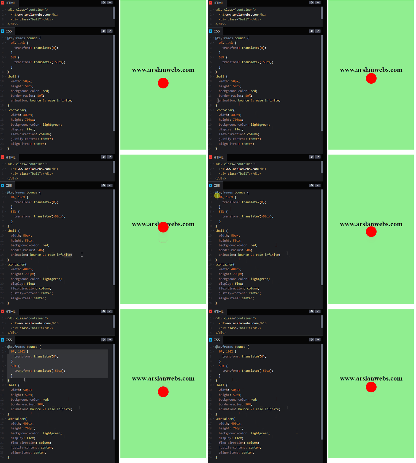
Example 1: Bouncing Ball Animation
Let’s create a ball that bounces up and down.
CSS Code:
@keyframes bounce {
  0%, 100% {
    transform: translateY(0);
  }
  50% {
    transform: translateY(-50px);
  }
}

.ball {
  width: 50px;
  height: 50px;
  background-color: red;
  border-radius: 50%;
  animation: bounce 1s ease infinite;
}

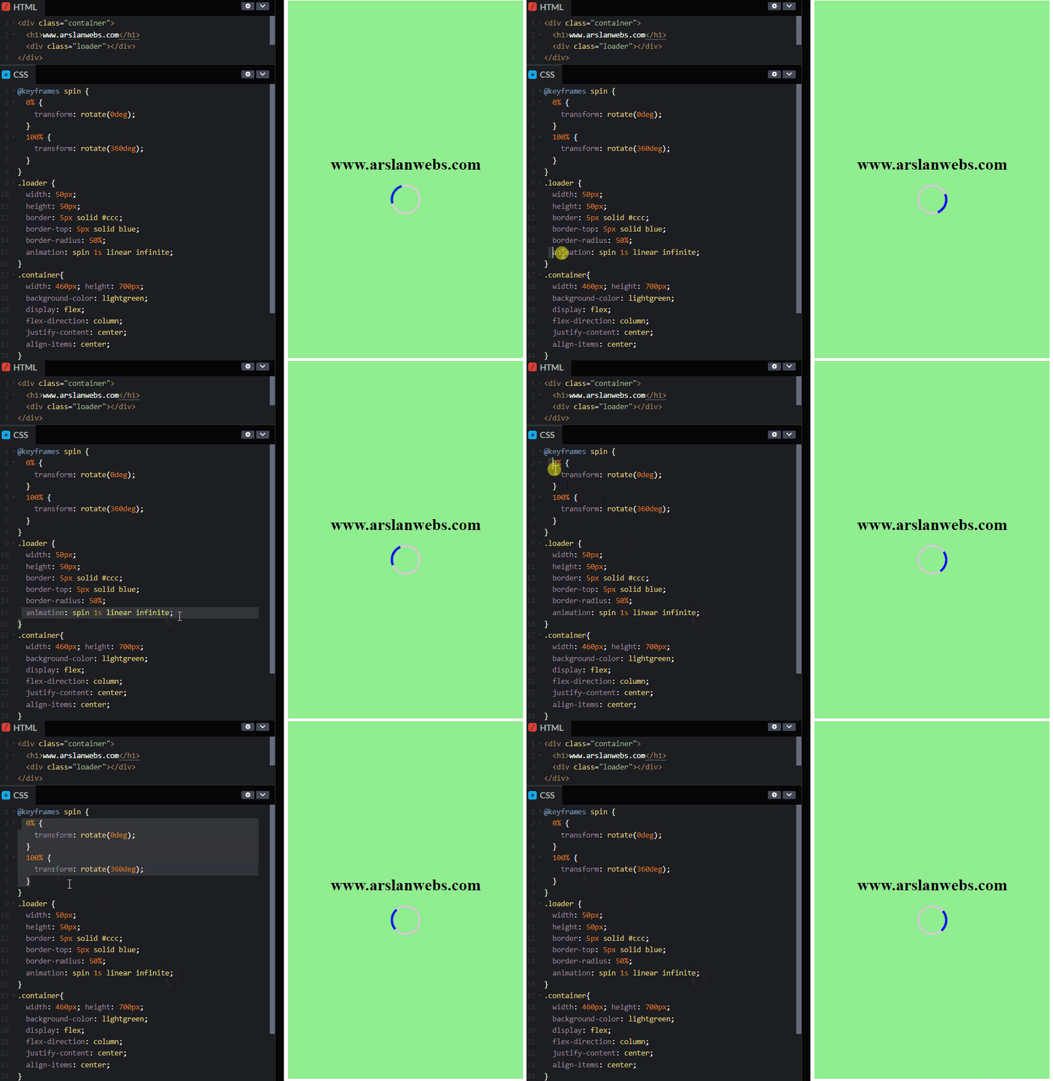
Example 2: Spinning Loader Animation
Create a spinning loader animation often used on web pages.
CSS Code:
@keyframes spin {
  0% {
    transform: rotate(0deg);
  }
  100% {
    transform: rotate(360deg);
  }
}

.loader {
  width: 50px;
  height: 50px;
  border: 5px solid #ccc;
  border-top: 5px solid blue;
  border-radius: 50%;
  animation: spin 1s linear infinite;
}

Common Mistakes to Avoid
- Not Specifying All Properties: Always define all necessary animation properties for consistent behavior.
- Using Long Durations Unnecessarily: Keep animations short to maintain good user experience.
- Forgetting Vendor Prefixes: Add vendor prefixes (
-webkit-,-moz-, etc.) for wider browser support. - Not Specifying
animation-duration: Without a duration, the animation won’t play.
Advanced Tips and Tricks
- Combine Multiple Animations: You can apply multiple animations by separating them with commas.
- Use JavaScript for More Control: JavaScript can trigger or control CSS animations for more advanced effects.
Conclusion
CSS animations provide a simple yet powerful way to add interactivity and visual appeal to your website. By mastering properties like @keyframes, animation-name, animation-duration, and others, you can create animations that captivate and engage your users.
Ready to make your website more dynamic? Try experimenting with CSS animations and see the difference it makes!

