Introduction to Flexbox: Creating Flexible Layouts with Ease:
Flexbox, short for Flexible Box Layout, is a powerful tool in CSS that allows you to create flexible and responsive web layouts with ease. Before Flexbox, designing complex layouts was often challenging and required hacks or additional CSS frameworks. Flexbox solves many of these problems by providing a straightforward way to align and distribute space among items in a container, even when their sizes are unknown or dynamic.
In this guide, we’ll take a deep dive into Flexbox, from understanding the basics to implementing practical examples. By the end, you’ll have the knowledge and confidence to use Flexbox in your own web projects, making your layouts more flexible and adaptive to different screen sizes.
Let’s jump in and explore the world of Flexbox!
1. What is Flexbox?
Flexbox, short for “Flexible Box Layout,” is a CSS layout model designed to help you create flexible and responsive layouts easily. It allows you to arrange elements in a container and distribute space between them, regardless of their size. This means your web pages can adapt to different screen sizes and orientations without the need for complex calculations or extra code.
Why Flexbox?
Before Flexbox, web designers relied on methods like floats, tables, and inline-blocks to create layouts. While these methods worked, they often required hacks or additional CSS to make elements align properly. Flexbox solves these issues by providing a straightforward way to align items, distribute space, and create dynamic layouts.
Image Placeholder: An image illustrating the difference between traditional layout methods (e.g., floats) and Flexbox.
2. Flex Container and Flex Items
Understanding the Flex Container
A flex container is the parent element that holds all the items you want to arrange using Flexbox. To create a flex container, you simply apply display: flex; to an element in your CSS. This turns the element into a flex container, enabling all its direct children to become flex items.
Code Example:
<div class="flex-container">
  <div class="flex-item">Item 1</div>
  <div class="flex-item">Item 2</div>
  <div class="flex-item">Item 3</div>
</div>.flex-container {
display: flex;
}The Role of Flex Items
Flex items are the direct children of a flex container. These items automatically align themselves according to the flex container’s settings, making it easier to create responsive designs. The flex container controls how these items are laid out using various Flexbox properties.
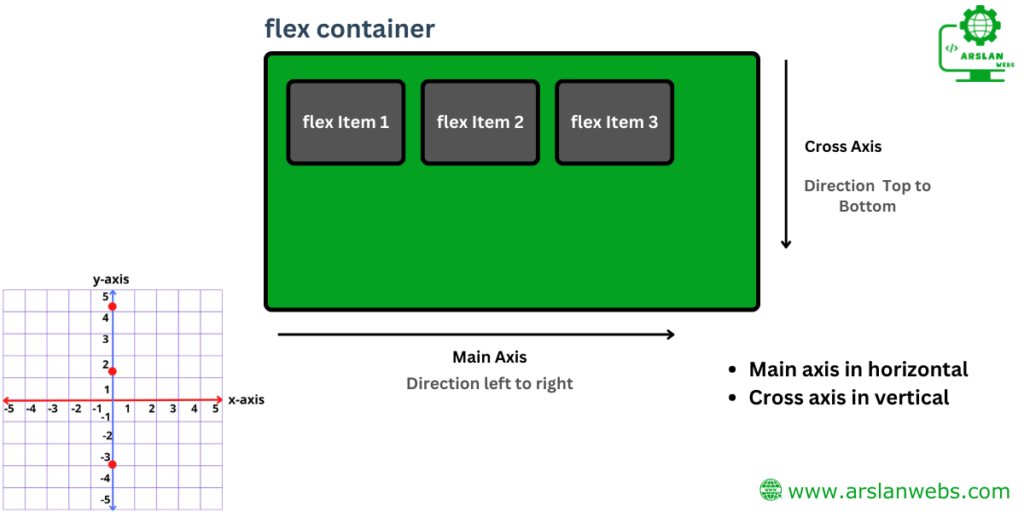
Main Axis vs. Cross Axis
In Flexbox, every layout has two axes:
- Main Axis: The primary axis along which flex items are laid out. It can be horizontal (row) or vertical (column) depending on the
flex-directionproperty. - Cross Axis: The perpendicular axis to the main axis. If your main axis is horizontal, the cross axis is vertical, and vice versa.

3. Flexbox Properties
| Flex container | Flex Items |
| flex-direction | flex-grow |
| flex-wrap | flex-shrink |
| align-items | flex-basis |
| justify-content | flex |
Flex Container Properties
1. Flex Direction
The flex-direction property defines the direction in which the flex items are laid out. The default direction is row (horizontal), but you can change it to column (vertical).
- row: Items are placed horizontally from left to right.
- row-reverse: Items are placed horizontally from right to left.
- column: Items are placed vertically from top to bottom.
- column-reverse: Items are placed vertically from bottom to top.
Code Example:
.flex-container {
  display: flex;
  flex-direction: column;
}
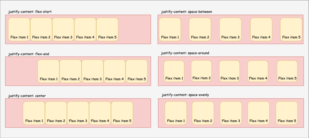
2. Justify Content
The justify-content property aligns flex items along the main axis. This property is useful for controlling the space distribution between flex items.
- flex-start: Items align to the start of the container.
- flex-end: Items align to the end of the container.
- center: Items align at the center of the container.
- space-between: Items are evenly distributed, with the first item at the start and the last item at the end.
- space-around: Items are evenly distributed with equal space around them.
Code Example:
.flex-container {
  display: flex;
  justify-content: space-between;
}
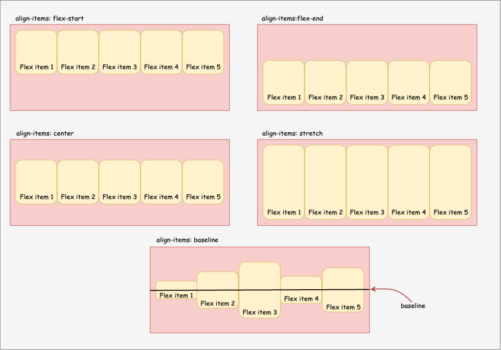
3. Align Items
The align-items property aligns flex items along the cross axis. It determines how flex items are positioned within the flex container’s height (or width, if the direction is column).
- flex-start: Items align to the start of the cross axis.
- flex-end: Items align to the end of the cross axis.
- center: Items align at the center of the cross axis.
- stretch: Items stretch to fill the container.
- baseline: Items align along their baselines.
Code Example:
.flex-container {
  display: flex;
  align-items: center;
}
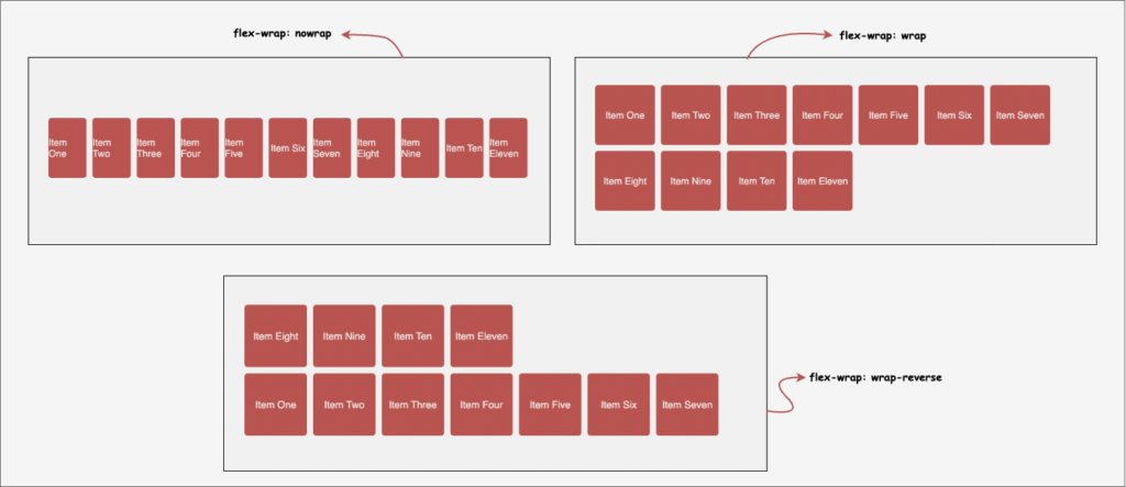
4. Flex Wrap
By default, flex items try to fit in a single line within the flex container. The flex-wrap property allows them to wrap onto multiple lines if there isn’t enough space.
- nowrap: All items fit into one line (default).
- wrap: Items wrap onto multiple lines.
- wrap-reverse: Items wrap onto multiple lines in reverse order.
Code Example:
.flex-container {
  display: flex;
  flex-wrap: wrap;
}
Flex Item Properties
1. Flex Grow
The flex-grow property determines how much a flex item should grow relative to the other items in the flex container. The default value is 0, meaning items won’t grow unless specified.
Code Example:
.flex-item {
  flex-grow: 2;
}In this example, the flex item will grow twice as much as the other items.

2. Flex Shrink
The flex-shrink property controls how much a flex item should shrink relative to the other items when there isn’t enough space. The default value is 1, meaning all items shrink equally if needed.
Code Example:
.flex-item {
  flex-shrink: 0;
}In this example, the flex item won’t shrink at all, even if there isn’t enough space.
3. Flex Basis
The flex-basis property sets the initial size of a flex item before any remaining space is distributed. It can be set in pixels, percentages, or any other CSS size unit.
Code Example:
.flex-item {
  flex-basis: 200px;
}This example sets the flex item’s base size to 200 pixels.
4. The ‘Flex’ Shorthand
The flex shorthand property allows you to set flex-grow, flex-shrink, and flex-basis all at once.
Code Example:
.flex-item {
  flex: 1 1 100px;
}This example means the item can grow and shrink at the same rate as others and has a base size of 100 pixels.
Image Placeholder: An illustration showing how the ‘flex’ shorthand property works.
5. Gap Property
The gap property (also known as column-gap and row-gap) allows you to set the spacing between flex items. This property is a powerful tool for creating clean and organized layouts without the need for margin tricks. You can specify a single value for both row and column gaps, or specify different values for each.
.container {
    display: flex;
    gap: 20px; /* Applies 20px spacing between all flex items */
}
To set different values for row and column gaps, you can use:
.container {
    display: flex;
    row-gap: 15px; /* 15px vertical spacing between items */
    column-gap: 30px; /* 30px horizontal spacing between items */
}
The gap property is a simple yet effective way to control spacing in your flex layouts, making it easier to maintain consistent spacing without adding extra markup or using negative margins.
4. Practical Flexbox Examples
Example 1: Centering Content
One of the most common tasks in web design is centering content. Flexbox makes this incredibly easy.
Code Example:
.flex-container {
  display: flex;
  justify-content: center;
  align-items: center;
  height: 100vh;
}This code centers content both horizontally and vertically within the container.
Example 2: Creating a Responsive Navigation Bar
Flexbox is perfect for creating a responsive navigation bar that adjusts
to different screen sizes.
Code Example:
.navbar {
  display: flex;
  justify-content: space-between;
  align-items: center;
}This example evenly distributes the navigation items and aligns them in the center.
Example 3: Building a Two-Column Layout
Flexbox makes it simple to create a two-column layout, which can easily switch to a single column on smaller screens.
Code Example:
.container {
  display: flex;
  flex-wrap: wrap;
}

.column {
  flex: 1;
  min-width: 300px;
}This code creates a flexible two-column layout that wraps into a single column on smaller screens.
Conclusion
Flexbox is a powerful tool in CSS that simplifies creating responsive and dynamic web layouts. By understanding its properties and how to use them, you can solve many common design problems with ease. Now that you have learned the basics and seen some practical examples, it’s time to try Flexbox in your own projects. Happy designing!
This post was designed to help you understand Flexbox in a straightforward and easy-to-follow manner. Remember, practice makes perfect! Experiment with different Flexbox properties and see how they can transform your web designs.
Start using Flexbox in your next project and see how much easier it makes your layout tasks. Share this guide with friends who are also learning web design!

